It took little more than a year from concept to production but MTNU is finally out! All sets have been shipped to vendors and a few lucky EU customers already got their copy! It’s time to review what we’ve done so far and see what is left to do for the near future.
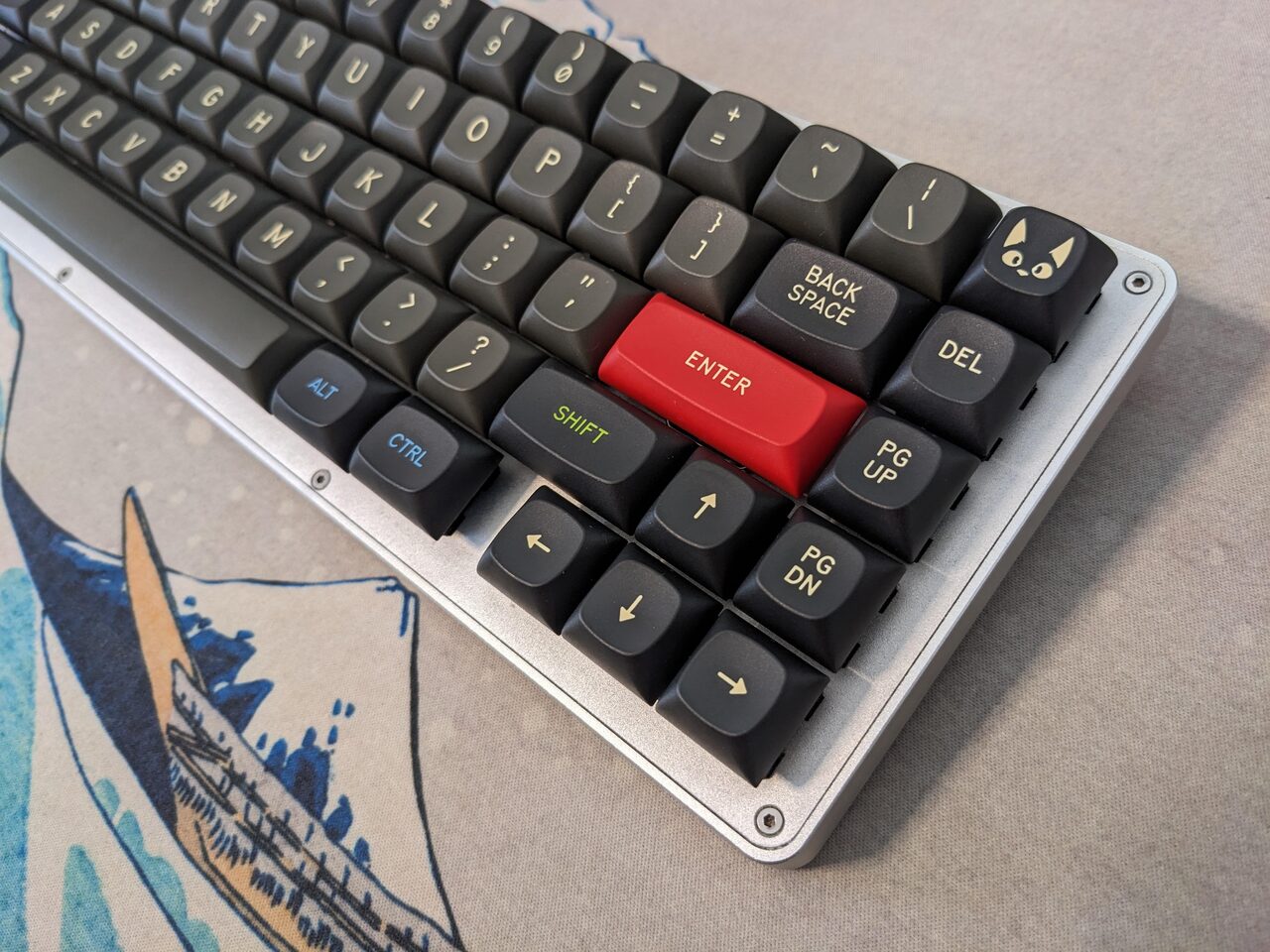
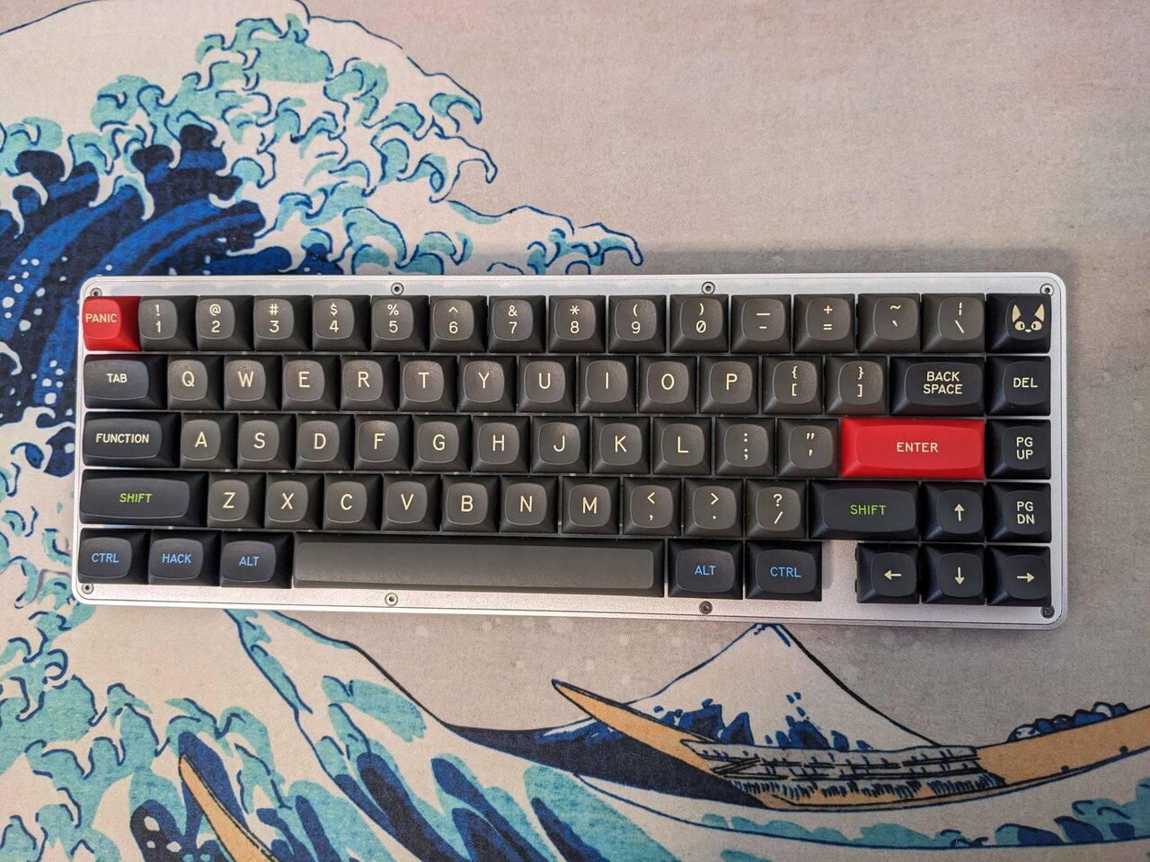
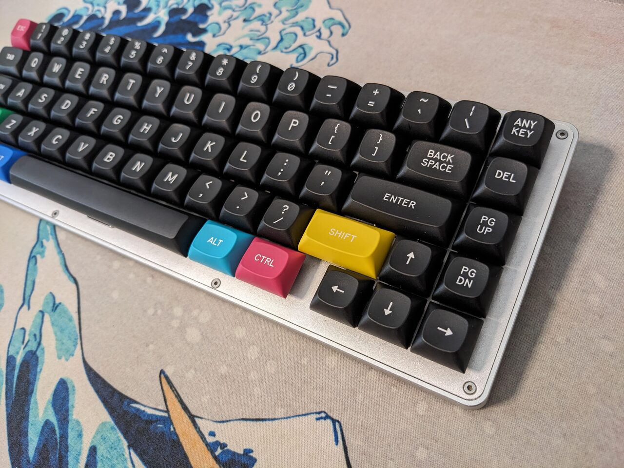
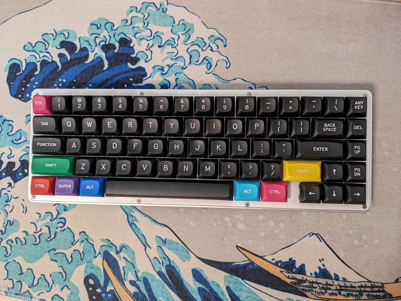
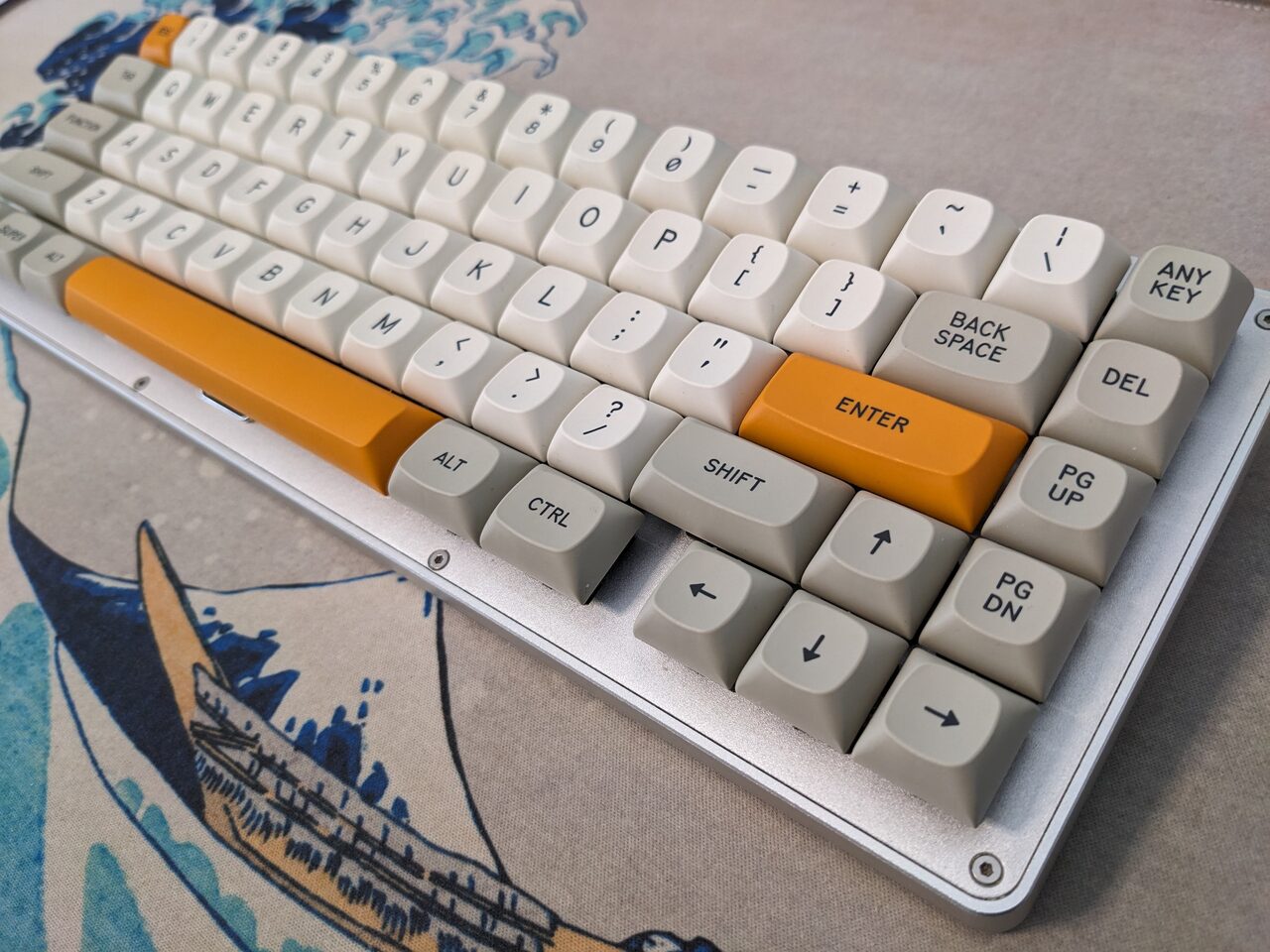
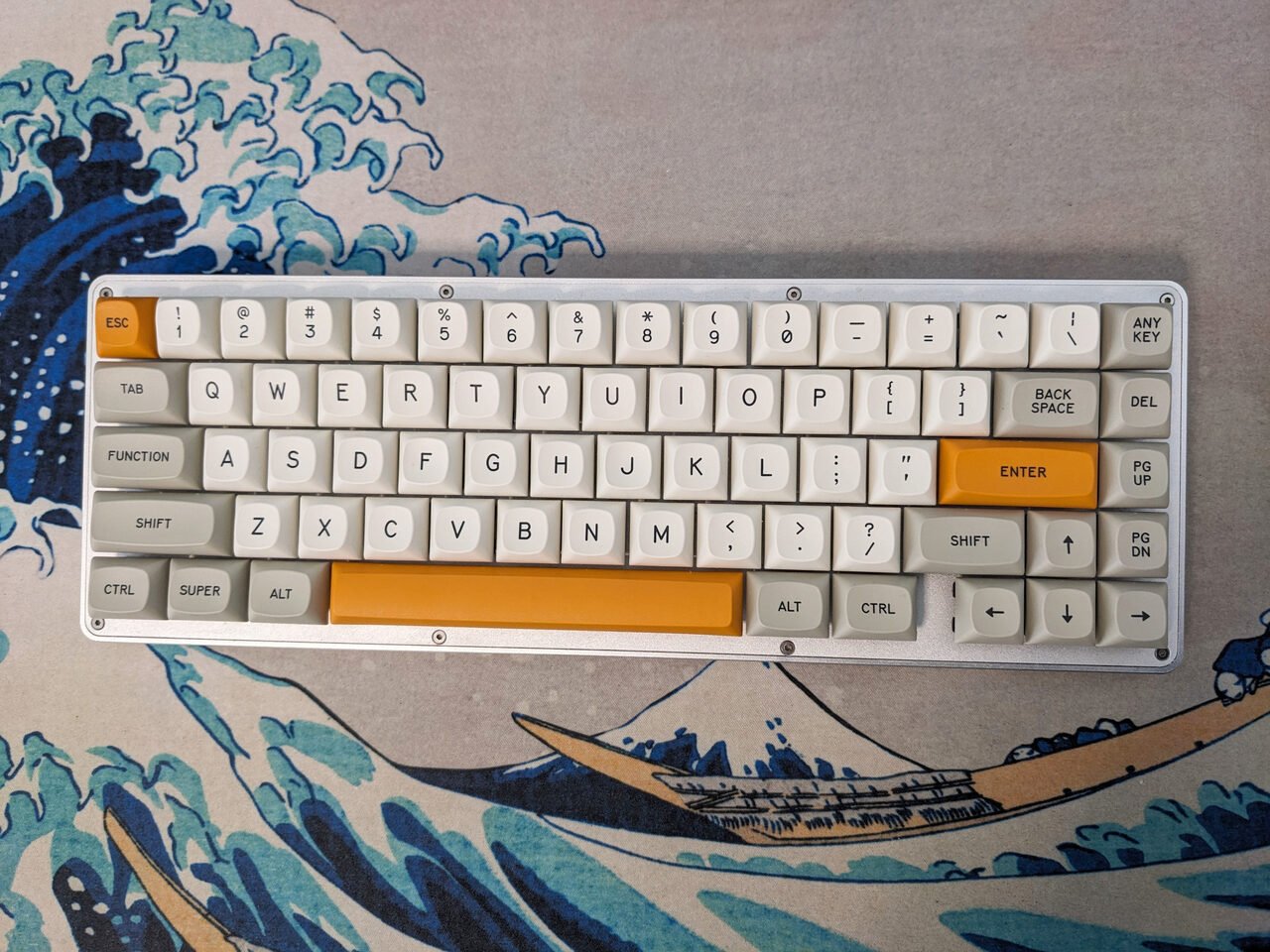
Let’s start with the first real-life not-rendered not-studo-shot pictures:


The good
I’ve been typing on MTNU since a few days now and I’m glad to report that my experience has been absolutely delightful. I’ve never actually typed on a full MTNU set until last Wednesday. All I had was prototypes and 3D printed caps for the missing key sizes. I knew the profile was going to be great but it was relieving to finally test it first hand.
If you follow my work you know that I’m not shy of criticism if something is not done to my very high standards, so let’s review how this MTNU actually is.
First of all the ergonomics, the tactility and overall typing experience. Those are the things that I value most. Texture is nice and smooth. Hitting area wide and welcoming. The profile is not aggressively angled but I find the ergonomics to be pretty good. I didn’t need any “break-in” period coming from other profiles which is quite impressive. It really feels like you can’t miss a key even if you try. So I’m happy to report that –at least in my book– the profile ticks all the right checkboxes.
The look. Well, that is subjective I guess. It’s my creature so I can’t help but love it. All three batch-1 sets look lovely. The colors are incredibly vibrant and don’t forget this is PBT.
WoB is incredibly elegant. The black background really enhances the look of the fine texture. The Beige one is a classic and I especially like the orange accent (I’m typing on it right now). And Susu… well… finally it was made with the right colors! We weren’t able to color match properly with MT3 but this time it’s just perfect, I’m keeping it for a new keyboard that I should receive shortly.
The typeface is just the perfect match for the shape. The double-shot job GMK was able to do is absolutely fantastic. I examined the keys under the microscope and I’ve never seen such injection-perfection before. I’m extremely pleased… but… (you know this was coming)
What can be improved
Before I go any further let me stress on the fact that 3-full-sets in 100% PBT for a completely new profile were manufactured in just 5 months (from first mold to delivery). That is absolutely mindblowing if you think at the difficulties GMK had in the past and it sets a really good pace for the productions to come.
When quality is already so high every little detail is important though. Legend alignment –especially when they are in the center of the keycap– is very important and even a small shift to any side is noticeable.
Due to GMK production process it can happen that the same legend has to be repositioned for a new injection (ie: for a new color). Considering the amount of unique legends and the incredibly small tolerances we are dealing with (we are talking even 0.2-0.3mm), errors can unfortunately happen.
I’m happy to report that 99.9% of the legends are aligned almost to perfection, but there are just a few that could have been better. Fortunately none of the “important” ones, but still this is something I talked to GMK, they are well aware and working on perfecting the production process.
The other thing is the spacebars. Don’t get me wrong they are nice and functional, but can be improved.
The problem here is that you have one mold but a limitless number of colors and pigment changes the characteristics of the resin. I’ve noticed that black (and dark colors in general) shrinks more than light colors. The beige spacebar is almost perfect for example, but on the 7U black one you can certainly see some bent on the far ends.


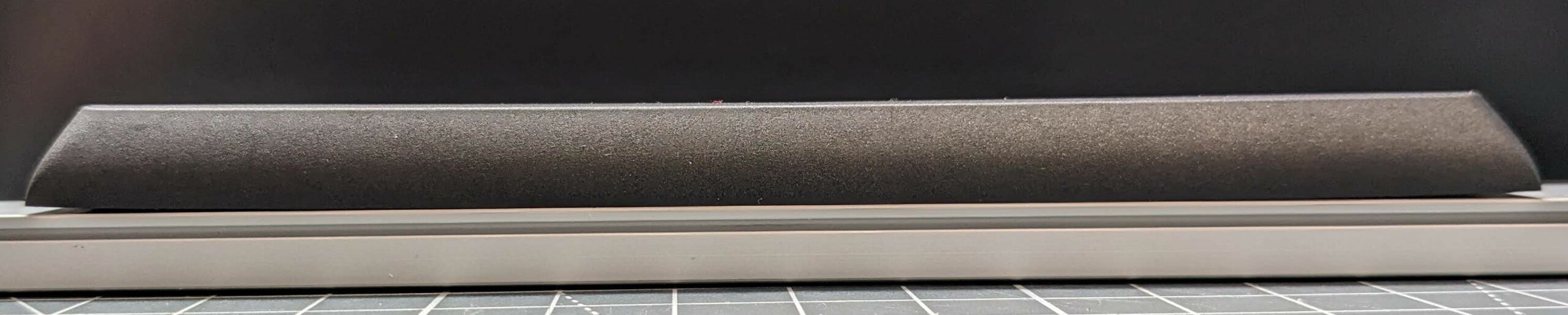
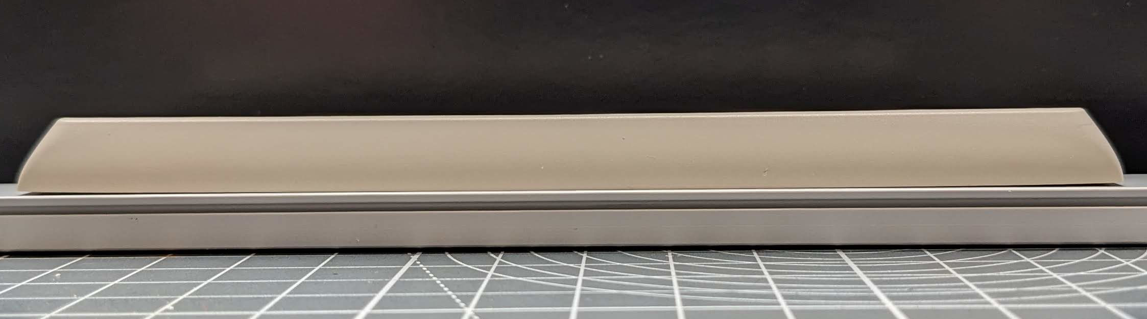
It’s nothing to be alarmed of, but GMK is aware and working on optimizing production.
The future is bright
I’m happy to see that some designers and vendors already started working on MTNU sets (like MTNU 800 and the Seneca) even before the profile was released… so a huge thank you for the leap of faith. (Contact me if I missed your project).
I’m working on icon modifiers for any future set to use freely and I’m also pondering the feasibility of an MTNU Space Cadet if I find the right partner.
I’m looking forward to hearing your impressions about MTNU, please let me know in my Discord server or just post anywhere and send me the link. I hope at the very least you’d appreciate the openness I always keep during the whole process. I’m first and foremost a keyboard enthusiast and I would never release something I don’t like or just to flood the market with new fancy gimmicks. MTNU is filling a gap in the market: medium height, spherical top and sleek as hell. I hope you’ll like it as much as I do.
We had a quick unfiltered unboxing last week if you are interested it’s still on YouTube.
Comments
Thanks for mentioning the MTNU 800 set! I’ve been wanting something like this for years and would’ve missed it if you hadn’t mentioned it.
I got my BoW set last Saturday night. Looks great. Types even better. Thanks!
Would have been nice if there were Mac modifiers… btw.
I wish that Kaiju and Metropolis would get ported/adapted to MTNU
I have just received the Susu set and yeah, they are great. I believe you have a hit a homerun with this profile.
thanks appreciate your message. I hope people will like it!
Really wish there was a 6u kit available anywhere
will come later!
I’m more than pleased with my MTNU Susuwatari set. Color and shape aesthetics are perfect and it feels great to type on. It’s my new favorite profile by far. You and GMK did an incredible job!
If a dedicated row 5 should ever be produced, it would be nice if there was “upgrade kits” just with row 5 keys for people that already own a 112344-set.
I bought an MTNU Susu set (almost) on a whim last week. I always found round profiles with nicely centered legends attractive, but the MT3 and SA ones felt a bit too high for my taste, so I was very interested when I heard about this new profile.
I received the set yestesrday and so far I love it : it’s beautiful and very nice to type on ! It really looks like the renders and images I’ve seen. And I love the Ghibli cat key !
The slightly not flat 7u spacebar doesn’t bother me at all, it’s not as if it was visible once it’s mounted on a switch. If I were to nitpick about it, that would be more to notice that under the right lighting conditions, one can see, and feel, the place where the bit that attach to the switch and the stabs is. But like the flatness, it’s not really a problem when using it.
Overall, I think it’s a very good job :) !
thanks for your feedback, I’ll make sure GMK receive all the complains!
Finally got my hands on these and first impression has been pretty good. Color on susu is hugely improved over the mk3 set. Build quality seems nice and solid and haven’t had any fitment issues on the stem sockets. Legends all appear to be well aligned on the keys I have so far. Texture on the tops is nice and noticeable, maybe even a little too heavy though its hard to say what that will look like after a few months of use, would still be happy with it even if it doesn’t smooth a bit. Only real complaint is that the ridge along the typing well is a little sharp. The renders don’t show this but it does show up a bit on the stream. Had the ridge itself been a little smoothed out or the well been a little more shallow it wouldn’t be as noticeable. I could see this ridge getting a little fatiguing after a few hours behind the keyboard. As so far only my numpad has arrived final thoughts on that will have to wait until the base set gets here. All in all they are gorgeous caps, and mtnu profile is a welcome contribution to the much neglected retro spherical style but a little more refinement would do a lot to make them nearly perfect.
Out of curiosity why was Susu the only set to ship without a numpad?
appreciate your feedback.
susu has an external numpad kit, it’s a test we made for a different kind of kitting with GMK. It allows to have more keys on the base (w/o the numpad of course).
Any ETA for ergo kits with MTNU? Blanks would be fine tbh but something like dev/tty R2’s ergo kit was just about perfect.
expanded compatibility will be available starting next year!
Mad kudos for MTNU, just received WoB.
For context, my favorite profiles are KAT, MDA & OSA (basically the top tier medium spherical profiles, I’m a coder & need a comfortable angle & height to jam on).
Quickly, this profile turned into my new favorite – very comfortable typing angle, great sound, strong tactility (better than all except for maybe MDA).
Downside is the abysmal GMK internal trays (keycaps arrived basically in a pile).
Also for some reason there is a slight defect for the letter K (the keycap sits very slightly higher than the rest of the caps, and more noticeable on long poles).
Cannot wait for a wave of new sets to arrive eventually (MTNU 2048, Mictlan or a Tokyo centric set like Nightlife (neons on dark base anyone!) & snag Susu when it comes for R2.
Thank you Matt30 & GMK for the inspiration on a killer profile, the future is bright.
hey thanks! Do you mind sending me detailed pics of the K key?
Awesome keycaps, I just received the Susuwatari set.
It feels really good, the only downside is that they don’t come with the 1.5 R1 ESC and 1.5 R1 DEL keycaps.
Hoping they will appear in the future.
Thanks for both, the MT3 and MTNU.
New favorite profile, I’m thinking. Such a great feel to the caps, with the benefits of PBT. No complaints here… Just (im)patiently awaiting some common colorways ^_^
I got Susu and WoB MTNU sets and absolutely love them. The look, the sound, the height, it’s all truly incredible. For future sets, I have a humble request. Please include an alternate F and J with homing bars or dots. I love these keycaps like no others, but even after a week of trying to get used to it, deep dish just doesn’t work for me.