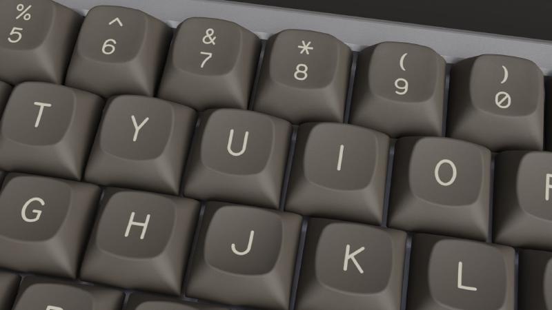
SOD is the original typeface designed specifically for MTNU. The idea was to revisit old IBM and RadioShack keyboards font under a modern light. The defining characteristics are an off-center mid line (that you can see on letters like E, F, H) and the use of “retro” numbers.
The font is released under a permissive open license to make it easy to anyone to add custom legends or modify what is already available. It is important to understand that the typeface is made for injection molding and not for writing. The font is offered mainly as a collection of glyphs for ease of distribution but it’s not suitable for screen and print. (And it also lacks a lot of characters like lowercase letters).
I noticed that during production small adjustments had to be made for line-height, kerning and thickness to meet certain manufacturing requirements and limitations. That lead to basically a case-by-case optimization that would very hardly translate into a working font. Just to make an example: CTRL on a 1.5-unit might have a slightly different kerning compared to the same legend on a 1-unit. When I realized that I stopped working on the font kerning so that aspect is something that has to be addressed by the designer.
The font is actually composed by 3 thicknesses. SOD Light is used for all alphas and single-legend keys (like +, × in the numpad). SOD Regular is for two-line numbers+symbols (like 1!, 2@, 3#, …). SOD Bold is used for modifiers and multi-letter legends (ENTER, BACKSPACE, …).
The difference between the three is minimal but very important. If we used the same weight for all legends the thickness at different sizes would vary too much leading to very thin modifiers or too thick alphas. Having three different fonts grants an overall very pleasing line-width all across the keyboard.
Please note that not all characters are available in all 3 weights. For example SOD Light doesn’t have symbols since we don’t need them at that thickness. In the future I might work on a more complete font file but for now I’m concentrated in designing the missing characters for Round 2 (namely more ISO languages and icon modifiers).
Font size is as follow:
- SOD Light: 23.5pt
- SOD Regular: 17.3pt
- SOD Bold: 13pt, line-height: 0.82 lines
I mostly use Inkscape for vector graphics, double check that the sizes are the same with other software.
A few design notes
I’m not a font designer and it shows. So far I always modified and customized already existing typefaces for my projects, this time I tried to bite more than I could chew but sometimes you get to take some risks. And I’m glad I did because I think the font really works great with MTNU.
If you are reading this you probably already know everything about typeface design but I learned a lot during the process and maybe someone will find the following reference useful.
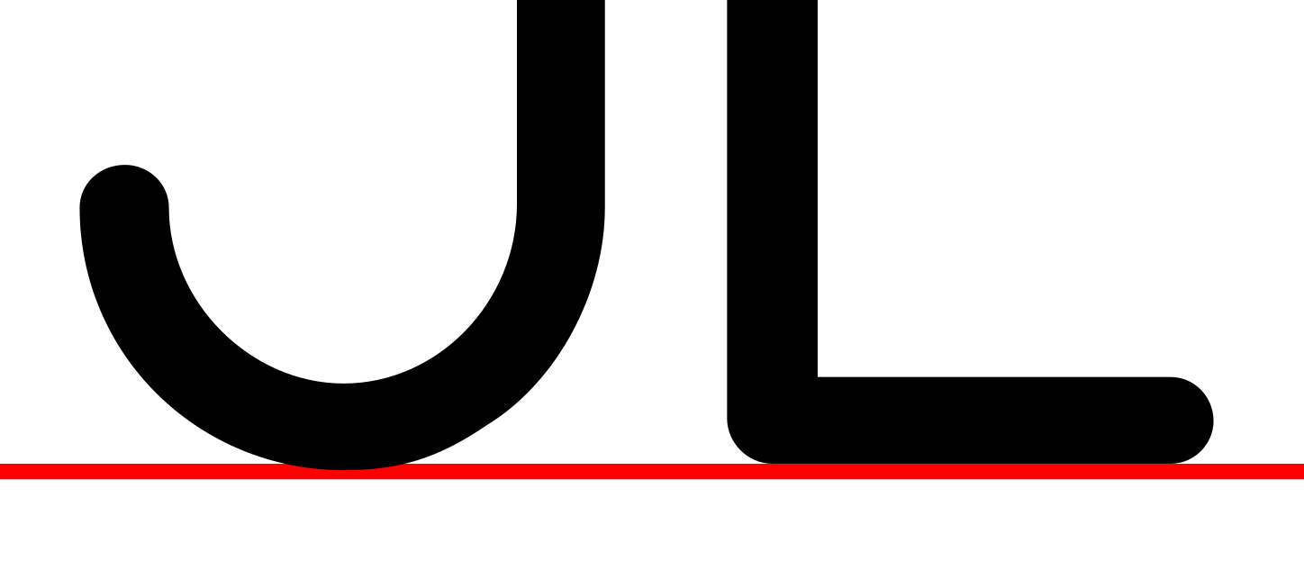
- Letters with a round base exceed the baseline.
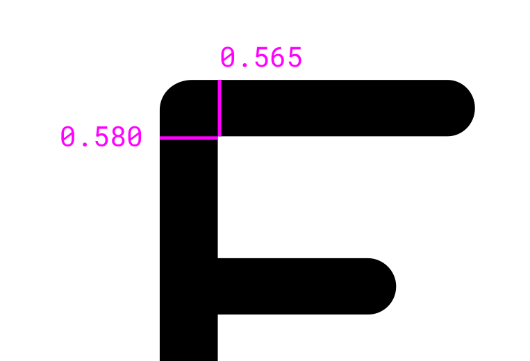
- Vertical lines are thicker than horizontal lines.
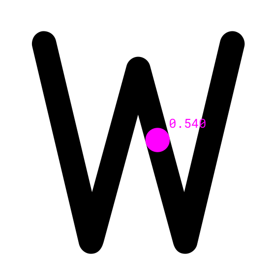
- Close diagonal lines are thinner (like in W).
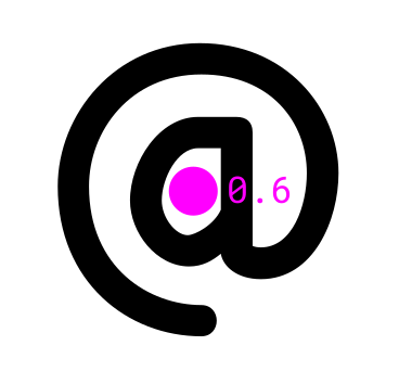
- Enclosed white space must be at least 0.6mm.
- Some shapes require subtle tweaking otherwise they look too thick in doubleshot (see the arrow picture below)
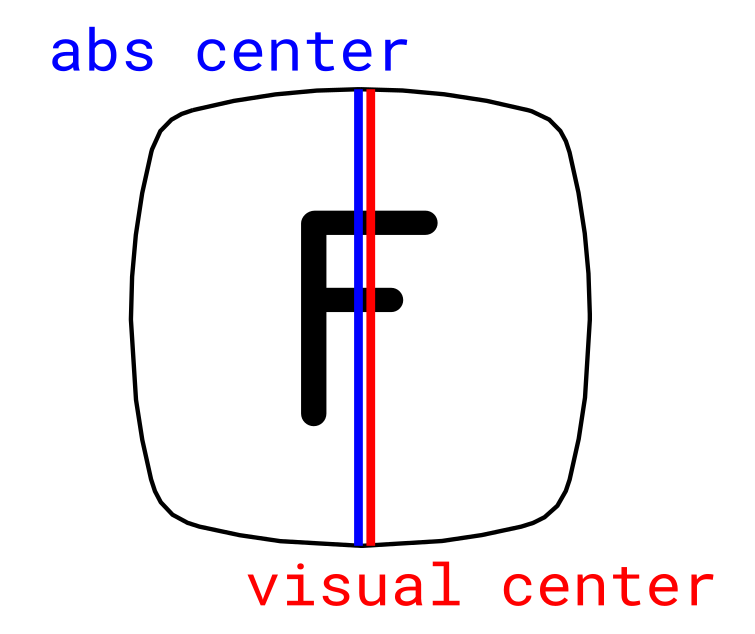
- Always align to the visual center not to the absolute center. Some letters (F, J, L, …) weight more on one side. You need to move the center to the left or right to counterbalance the visual weight (see picture)
The pictures below illustrates the previous points (click to zoom).
![]()
In the coming weeks I’ll post more reference material and possibly put everything on github. In the meantime you can download the font here below