Development of the Tolkien sets is proceeding at a steady pace. The colors are pretty much final and the manufacturer has already produced a few test keycaps. This is just a quick update before the Holidays.
A few changes since last time.
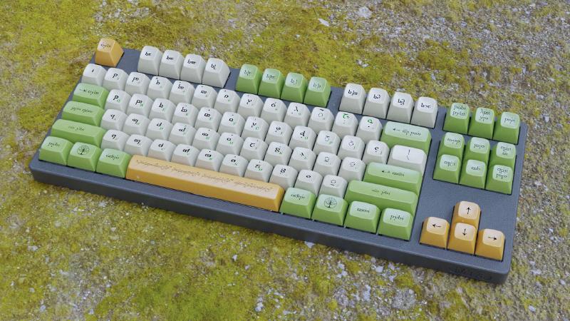
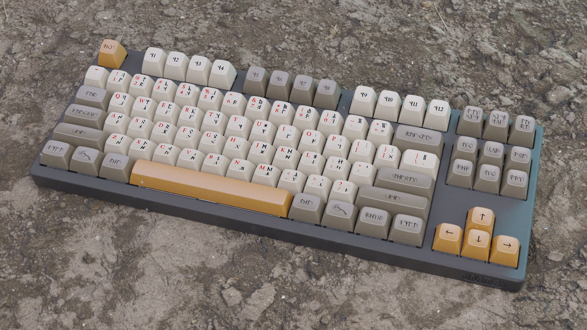
The alpha background will be lighter so we can have secondary/tertiary legends in a different color. I believe the end result is much better. The elvish set will be available in both dual language and Tengwar only; dwarvish I’m afraid will be only dual legend, but with the added secondary color I believe it’s totally okay.
The accent color (ESC, Spacebar, arrow cluster) will be optional, you’ll be able to use the standard modifier color for those keys (and alpha color for spacebar).
The Elvish set will probably have 2 accent colors (yellow and rose pink). The Ring inscription on the spacebar will be optional.
Regrettably we won’t have any Sauron set, we simply don’t have enough material to build a keyboard in Black Speech.
I’m also working on the iconography. A very huge limitation that I have is that I can’t use anything that comes from the movies. Everything must be designed from scratch and it’s not easy to forget all the wonderful imagery Weta created for Peter Jackson’s films.
The icons should be of course compatible with the Elvish/Dwarvish legends that we are using; I made a few tests and I would like the icons to be like drawn by Tolkien himself, like they were notes and “scribbles” at the side of a map.
![]()
It’s just a draft I’m working on, more work is needed but they should set the overall mood.
Another thing I wanted to work on is The One Ring inscription. If you google it you’ll find the same image we all know. I always found it… wrong… I think it’s something that was done by someone one time and since it’s good enough nobody bothered doing it “right”.
The image is based on Tolkien’s ring inscription. It is written in cursive Black Speech and once wrapped around a circle doesn’t work very well.
So the following is what I came up with. On the left the original as we all know it, on the right the one I made.
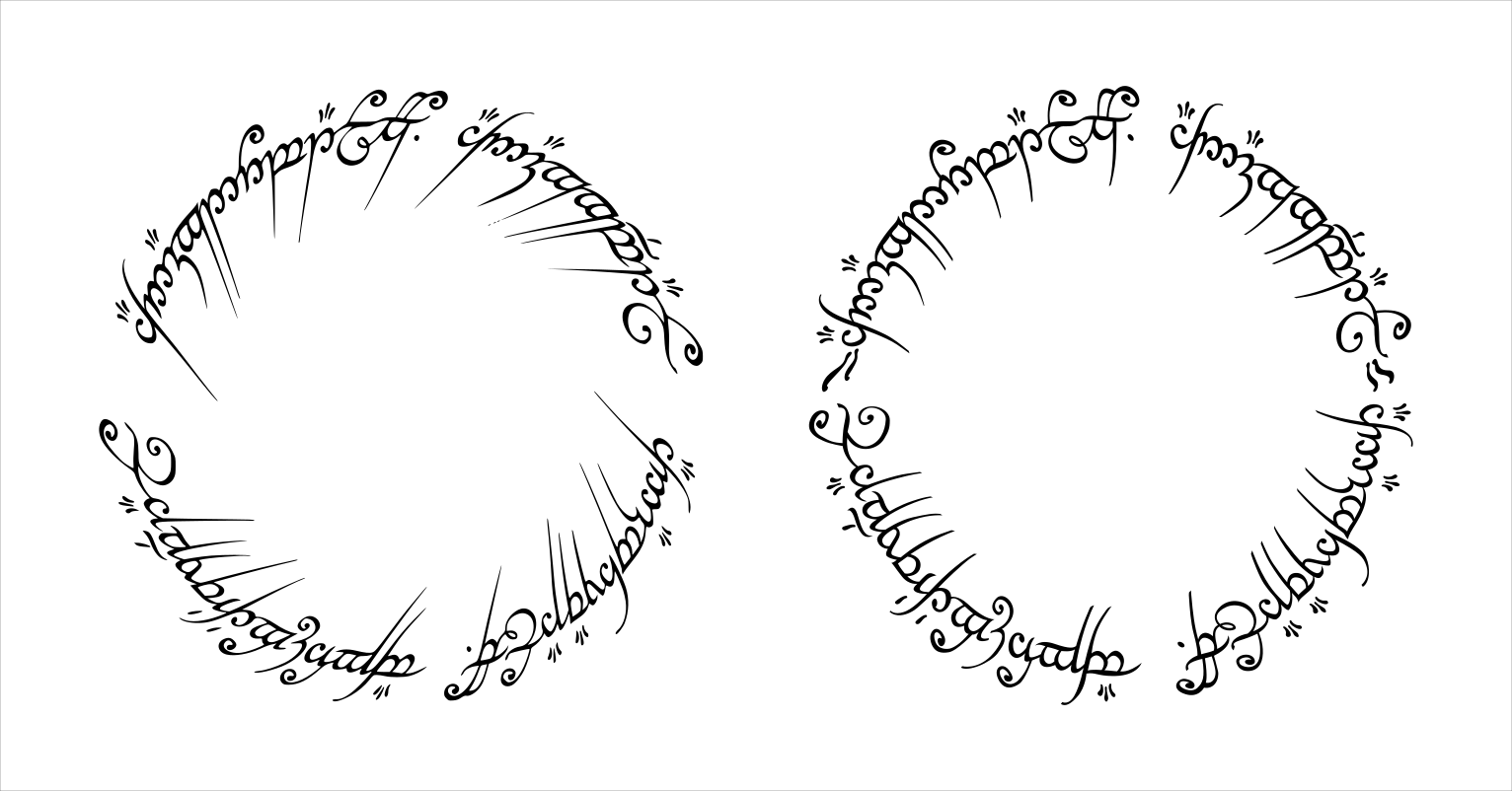
I know, the difference is minimal and the original is maybe more “aggressive”, but I find the one on the right to be better overall calibrated.
If you are interested you can freely download and use my file (SVG).
We are also working on some artisan/novelty keys. I’m not sure yet what we are going to do but the Arkenstone –if done right– would be really nice.
That’s all for today. Happy Holidays and have a great new year, 2020 has set such a low bar that it can only go better!