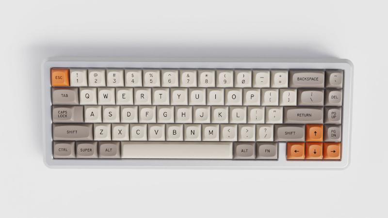
Time flies when you are designing keycaps! 3 months have already passed since the announcement of my collaboration with GMK and MTNU has already gone through multiple revisions. I think it’s time for a well due update.
The main shapes and physiology of the profile are defined but small adjustments can still be done. We had a few prototypes 3D printed to check the overall look’n’feel and GMK is working on the tooling as we speak. The first batch of injected proto-keycaps should be manufactured in about a month, that will give us a better sense of what this profile will actually be. I don’t hide that I’m a bit scared but mostly excited :)
MTNU in a nutshell
A quick recap for those who don’t know what MTNU is about.
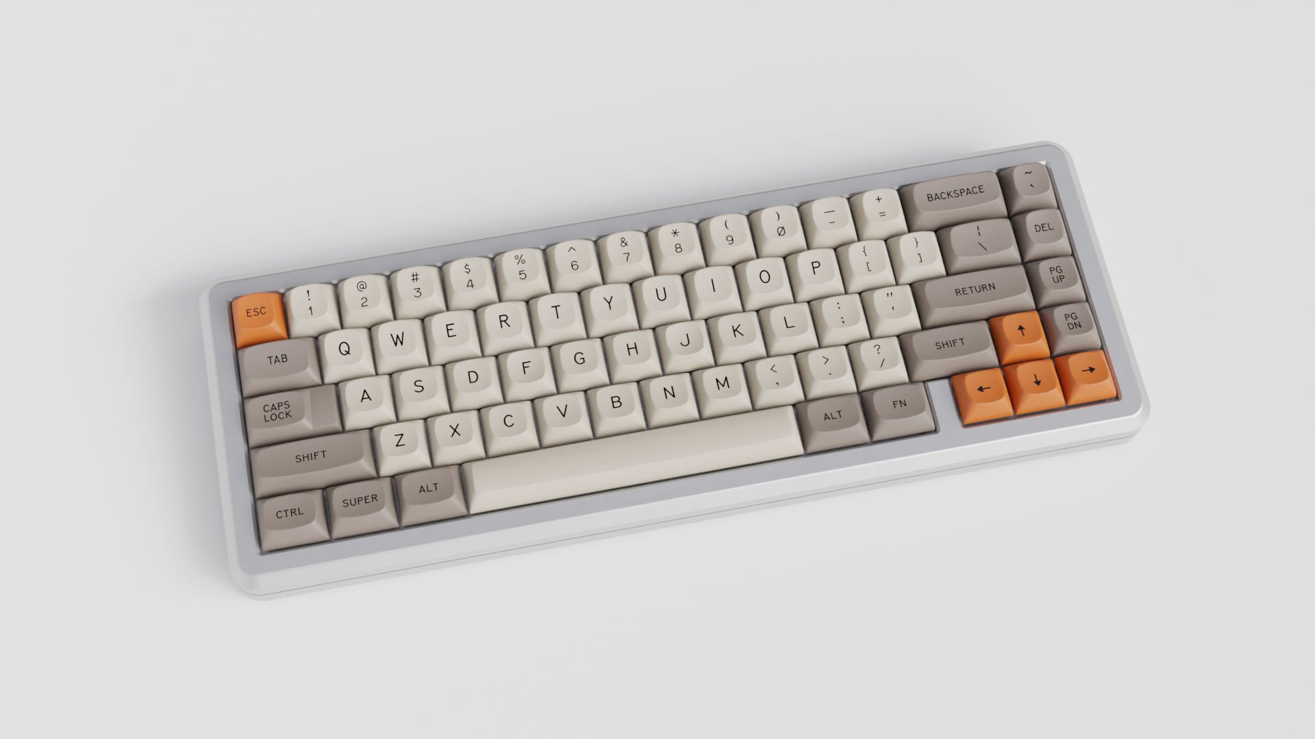
MTNU is a medium height spherical top keycap profile designed by yours truly in collaboration with GMK. The idea would be to create a new standard for spherical top like the “Cherry Profile” is for cylindrical. Ambitious I know.
The defining characteristics are a nice round hitting area and an inviting smooth curve on the top contour, together these factors should grant a pleasant typing experience without sharp edges.
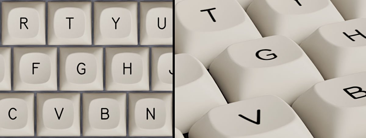
Height is close to standard Cherry if not a bit taller but angles are less steep; looking at it from a side the keys form a soft curve.
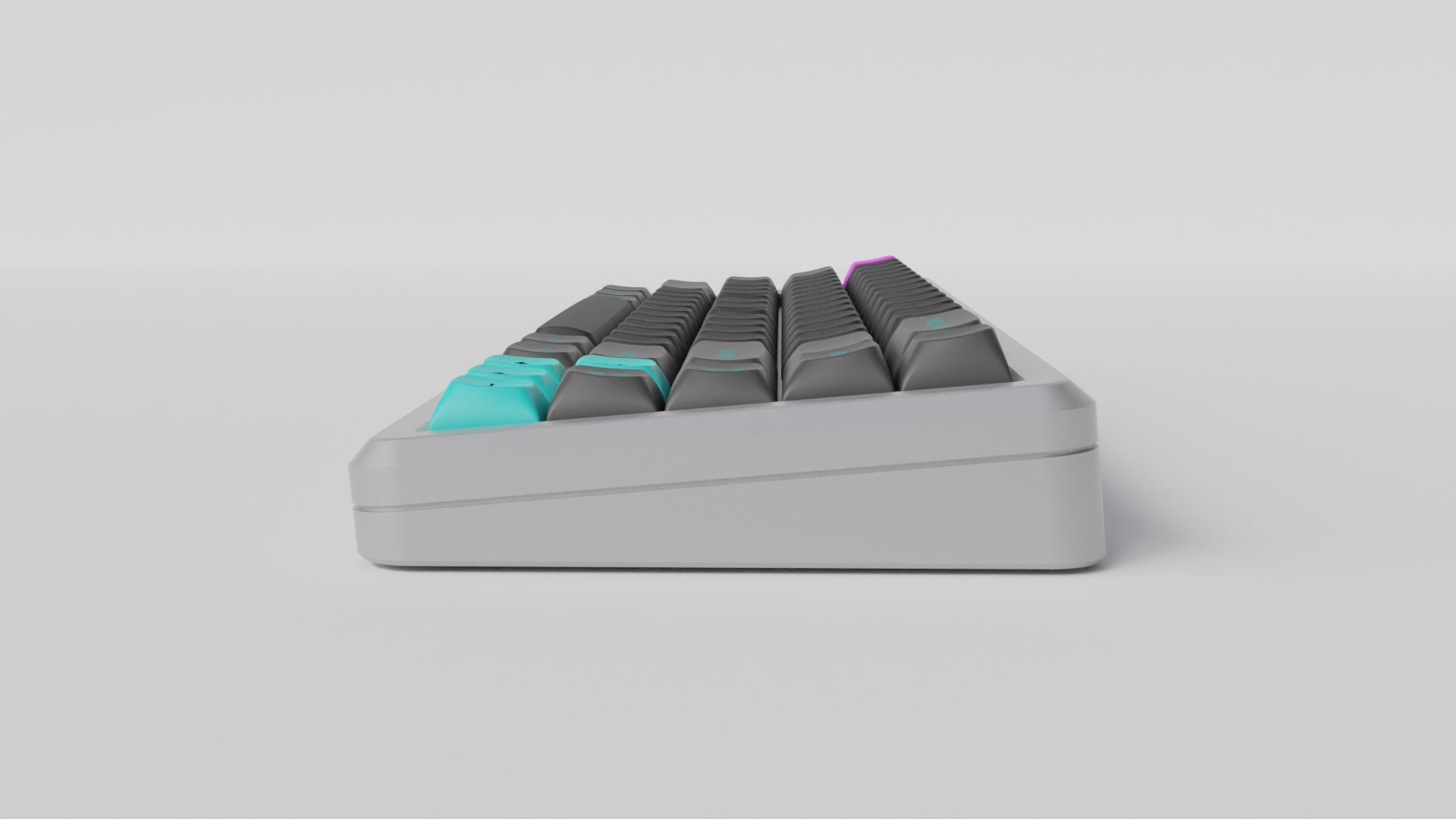
The row profile will be: R1-1-2-3-4-4. If MTNU will be successful we might work on R0 and R5 (a flat bottom row) but R4 is not too sharp so it shouldn’t be a deal breaker.
GMK is all about double-shot so no dye-sub. Initially we opted for a PBT blend but looks like pure PBT is actually doable. I believe they are still experimenting with the resins and I’ll know more in the coming weeks.
As per side thickness, I don’t have a final value yet because that also depends on the inside doubleshot (that I don’t have yet), but should be around 1.5mm. I’ve been asked quite a lot if they are compatible with both North and South mounted switches and I don’t see any problem either way, unless you use a pass-through LED with a big head (but that is the case with any keycap).
Legends
I’m designing a new typeface just for this project (pictured below). The name is Son Of a Doubleshot (SOD) and it is inspired by vintage keyboards but with a more modern flare. It is not an eccentric typeface but it has a few distinctive traits like the barred 0 (zero).
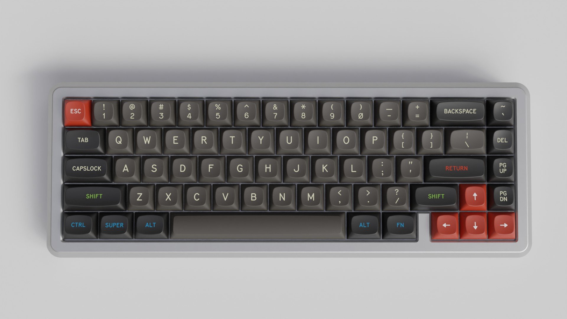
I’ve been criticized in the past for picking up fonts that trigger OCD. I’m sorry guys, but I believe a font needs character, you need a “kicker”, something that catches your eye, even that disturbs. A perfectly polite typeface is not part of my DNA. I hope with SOD I was able to strike a good middle-ground.
Also SOD will be available for anyone to use and expand.
Keyboards support
At start MTNU will cover a standard ISO/ANSI keyboard, of course numpad, 65/75% and winkeyless. If everything goes according to plan we’ll add better support for 40% and more arcane layouts. That being said I’ll do my best to push a wider support at launch as I believe it’s important to start with a bang, so cross your fingers!
Keys likely to be available at launch date:
ROW 1
- 1U
- 2U
ROW 2
- 1U
- 1.5U
ROW 3
- 1U
- 1.75U
- 1.75U Stepped
- 2.25U
ROW 4
- 1U
- 1.25U
- 1.5U
- 1.75U
- 2U
- 2.25U
- 2.75U
Spacebars
- 2U
- 2.25U
- 2.75U
- 6.25U
- 7U
Special
- ISO Enter
- 2U vertical R2-3
- 2U vertical R4-4
Keys to be manufactured later:
ROW 1
- 1.5U
ROW 2
- 1.75U
ROW 3
- 1.25U
- 1.5U
Spacebars
- 1U
- 1.25U
- 1.5U
- 6U
ROW 5 might be part of phase 3, with basically everything in R4 plus spacebars. ROW 0 would be the easiest to do as it only includes one 1U mold.
Texture
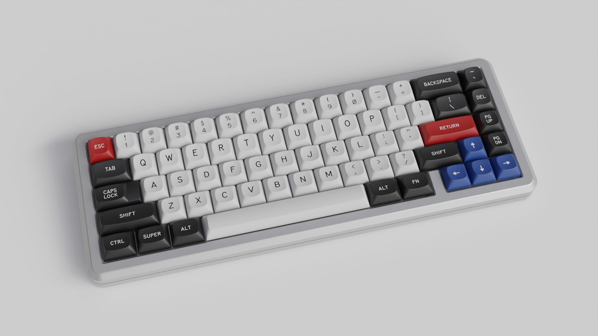
Another important factor for any keycap is surface texture. As much as I love super smooth keycaps they pose some quality risks. Specifically when the surface has no texture at all you might start seeing injection marks. If you look closely at the back of SA keycaps you’ll see what I mean. So MTNU will have the lightest texture possible that lets us still hide those marks.
And now the important bits…
When and Where?
The profile should be ready in Q1 2023. If I had to guess I’d say somewhen in Spring. Don’t quote me on that, though, and don’t tell GMK I’ve told you :D
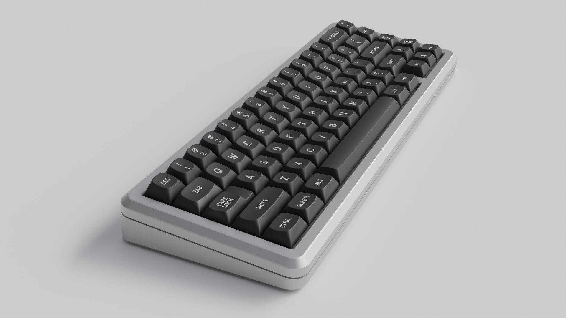
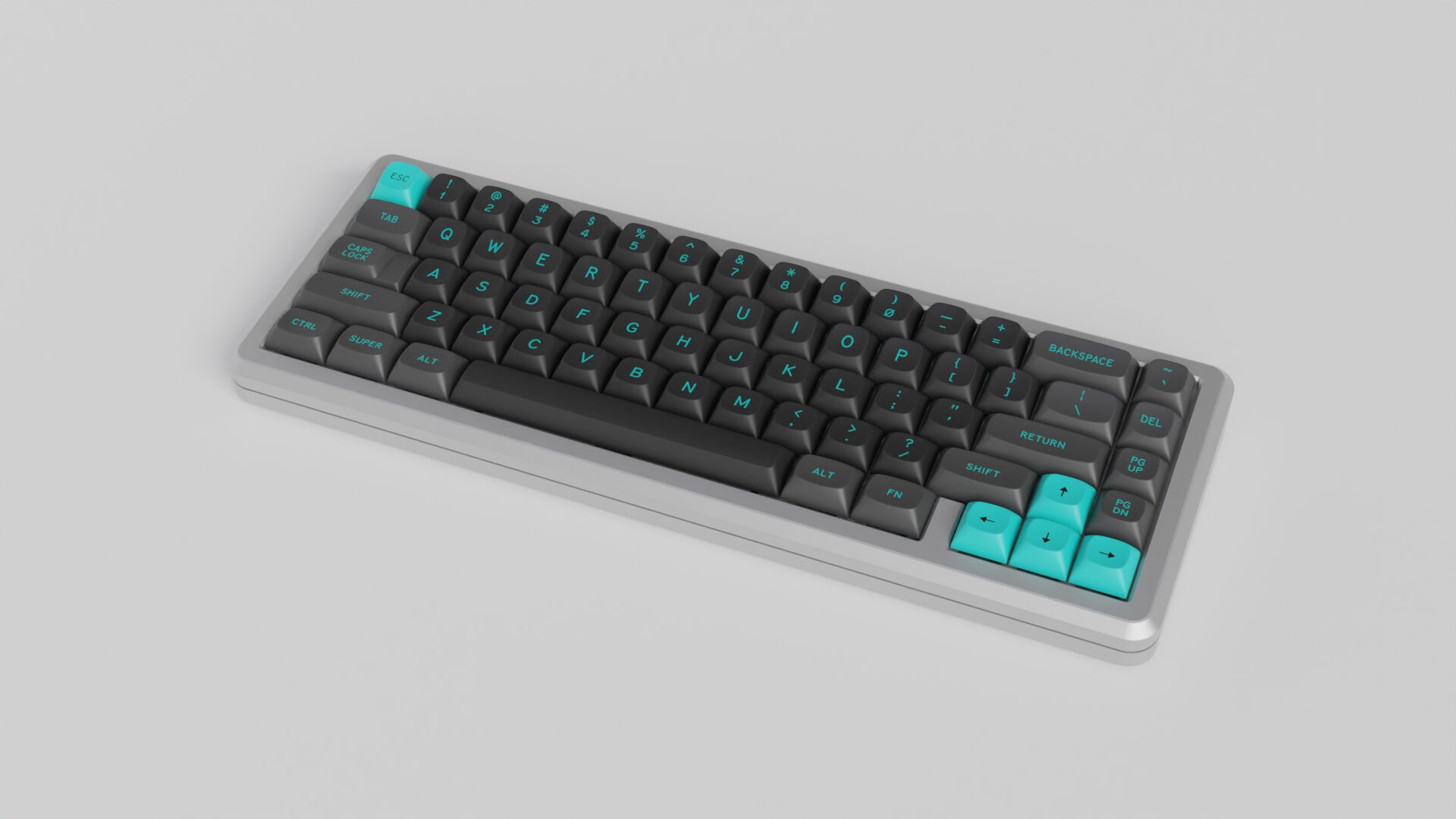
The color schemes most likely to be manufactured first are (in no particular order): White on Black, Black on White, Beige, Susuwatari, Dolch.
Remember that MTNU is not an exclusive profile, anyone with the right MOQ can join the party without asking permission to me or anyone. It’s also vendor friendly and can be sold all over the world (unlike MT3 which is a Drop exclusive).
Shut up and take my money!
A bit early for that, I’m not sure about pricing but some of the design paths were taken with pricing in mind so I hope it won’t be too bad. Stay tuned, you’ll be the first to know.
So what are next step? This October we should see the first injected and double-shot keycaps, if that goes well we should be on track for an early 2023 release. As soon as GMK sorts out pricing we’ll contact vendors and proceed with the first pre-orders.
I still don’t have a final word on this but it is my understanding that GMK is willing to also work on stock availability, not only group buys, I’ll keep you posted on that too.
I know… Not many juicy news, but I wanted to update you guys anyway. Development is proceeding fast despite the production difficulties that Covid and energy crisis are posing us. Hopefully a month from now I’ll be able to show you the first real MTNU keycap! Stay tuned!
