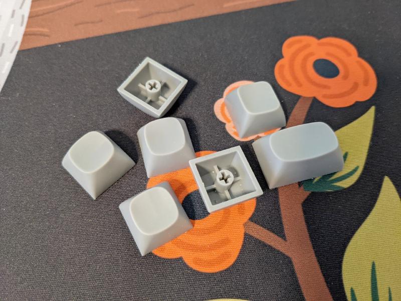
After 5 years from MT3 I’m finally working on a new keycap profile. It’s still spherical top and sculpted but medium height. In many ways it’s an evolution of the MT3 design but they are different enough to coexist. I’m still early in the development process but I want to show you the current state of thing so to get feedback and suggestions.
The why
Many years have passed since MT3 and I now have more resources not to mention experience to design and prototype the keycaps at home. I have a very high quality resin 3D printer that I’m using to test each iteration of the new caps and I can make quick adjustments in a matters of hours instead of weeks (or months) as it happened before.
MT3 is a great high profile set done as an alternative to SA that was pretty much the only option at the time. Even if we extensively worked on ergonomics, it is not for everybody. The tall nature and sharp edges can be daunting to some so it’s time to build something more general purpose and that you would use on any keyboard.
The who
This time I’m 100% designing the product and I will involve a manufacturer only when I’m sure the profile is perfect. I don’t want to get sucked into a corporate agenda until the very last moment.
I am of course looking forward to receiving feedback from the community, but no money is involved during the design phase.
Design, CAD work and initial prototyping is done by yours truly; regarding production things are of course more complicated. I’ve been contacted by quite a few companies that are interested so I’m confident we have a good chance of bringing this thing to life, but —again— at this stage I don’t want to think about that.
The design
The key features are:
- medium height
- sculpted profile
- spherical, round top
- perfectly smooth top surface
- curved top edges
Let’s go through all the points.
First of all it will be medium height. Somewhere in between MT3 and DSA. Think of it as the spherical top counterpart of a cherry profile, even though R3 will be probably a tad taller.
The profile will be sculpted and it’s not clear if the rows will be 1-1-2-3-4-4
or 1-1-2-3-4-5
or 0-1-2-3-4-5
.
Every company/manufacturer I talked to like 1-1-2-3-4-4.
It’s easier to make, kitting is simpler and shipping is lighter. While I don’t mind ditching R0 (basically a dedicated function row) I’d still like to offer the option of a flat Row 5 as MT3 does (even though recently Drop is rarely offering that option).
At the current stage R3 is on a -4 degree angle. To give you an idea MT3 is at -7 deg and SA is at 0 deg. The other keys are built upon that so to create an harmonious curve.
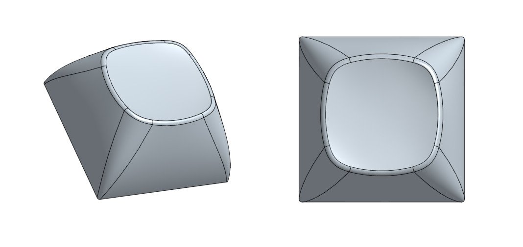
The top dish is spherical with a round outline. If you look at MT3 or SA you’ll notice that the top shape is mostly a square with rounded corners. The new profile is more rounded.
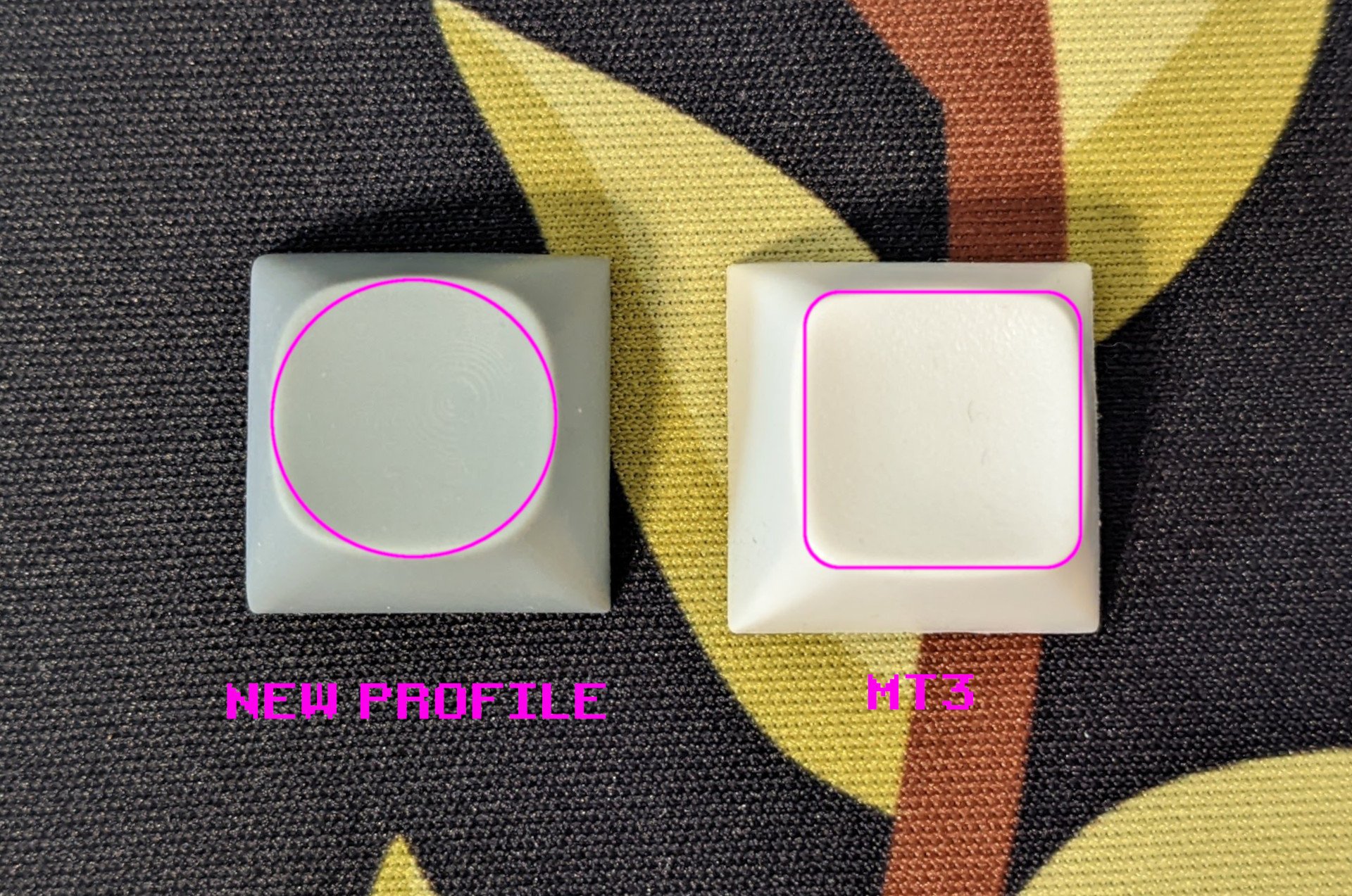
Another important factor I worked on is the smoothness of the dish. I’m not talking about the texture but the actual geometry. It’s hard to explain without feeling it on your fingertip, but most of the spherical top keycaps I’ve tried have very faint inconsistencies in the shape of the scoop. Creating a perfectly smooth surface out of a not perfect circle turns out to be quite the task, anyway for now you’ll have to trust me on this, the new scoop is so darn smooth (maybe you can tell from the pictures).
The footprint is also about 0.1mm smaller than MT3, that should help when a keyboard frame is slightly out of standard and thicker than usual. The new size should easily fit any keyboard.
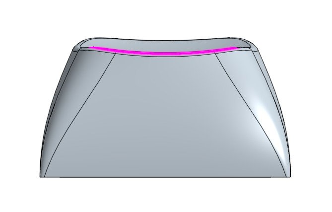
Last but not least, the top edge is not straight but on a curve, that should help making long typing sessions more comfortable. Some reported a sharp edge on MT3, I believe this solution is rather elegant.
The material
As you know by now I’m a PBT guy, but I’m open to discussion. It will also depend on the manufacturer capabilities. In recent years I’ve seen decent 2-shot PBT sets, so that’s also a possibility. TL;DR: too early to say.
Current status
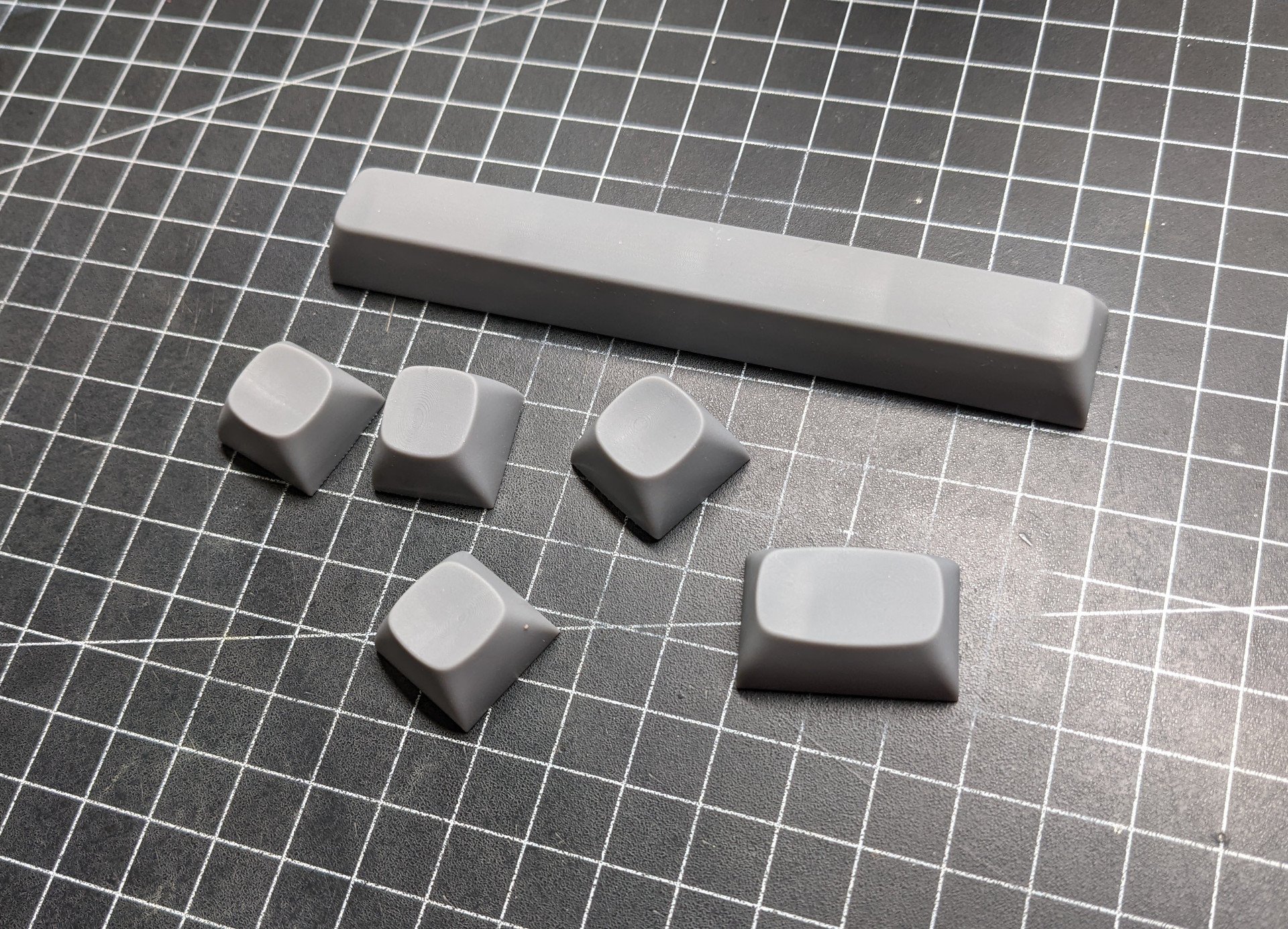
The main shape of 90% of the keys is done. I miss stepped capslock, ISO Enter and vertical 2u keys. Everything else is ready. That being said, every aspect of the keycap (roundness, dish depth, side thickness, top angle, key height, …) is parametric. That means that I can change a few parameters and automatically get a complete updated set. So any change can be done almost on the fly.
I already ran two rounds of prototypes and I’ll print more this week, unless I made some terrible mistake I’d say the final prototype should be ready in a couple of weeks.
At this stage I very much welcome any feedback. The comment section is just fine or you can drop me an email. I’ve also set up a Discord server if you want, but I don’t have much time to dedicate to it so it will be a bit deserted :D …
Anyhoo… Here’s the Discord invite.
Comments
How is 40% support? Not to be that guy, but… r2 1.75u, r2 1.25u, and r3 1.5u would be very pleasant to see. Of course, more than that would be even more appreciated, but I won’t pester for more than necessary.
design wise, I can do whatever I want, but ultimately it depends on what the production can do. It’s a bit early to say but I will of course push for as many keys as I can :D
Are you going to aim to release a dark blank set this time? :)
I would love for these to exist as either ABS or doubleshot PBT, just for the richness and darkness of colors that makes possible. I’d be interested in seeing sets in a darker color scheme along the lines of Susuwatari or the all-brown version of Retro more than beige and pastels, but that’s just my personal preference.
The footprint is also about 0.1mm smaller than MT3 => This sounds like a very good idea. Naturally it is not the fault of MT3, but some of my keyboard cases have a bit of interference with the corners on some keys that either need some adjustments to the keys (like for the Q1) or a lot of fiddling to try to get the plate mounted differently.
Another random note, but this is personal taste, in the above photo the space bar: I would actually prefer if the left/right sides are even more curved, somehow the curving looks great for the 1u or 2u keys but somehow strange for the >= 6u spacebar. But that might be just my impression and I have no idea about design :)
In any case: Great that you work on a new project here, I hope this works out well!
you are spot on regarding the spacebar. That was a first test and I definitely want to make it more round!
:) Cool, then it was not just my impression.
Congrats matt3o,
it looks like a great profile. I totally feel your description of the dish being very smooth geometrically. I’ve done fifteen revisions for my personal profile until it felt right. It truly is a challenge to round out a super ellipse.
For row sculpt, I think the angles works quite well for a low profile. From my experience, the fingers will have easy travel across the rows. But not all hands are created equally :D
For now, I wish you all the best for the final stages and further for production.
Greetings,
Andreas
Regarding row sculpt, would 1-1-2-3-4-3 fit your design goals? It would avoid having a unique set of sculpts for the bottom row, and kitting-wise it tends to be about on par with 1-1-2-3-4-4 profiles.
my goal would be to make 1-1-2-3-4-4 (+5), with R5 as an option. 1-1-2-3-4-3 is a possibility but I guess the whole point of 4-4 bottom rows is to reduce the keys count, so I’d would rather do 4-5 than 4-3
I guess my point is that you get some reduced key count out of 4-3 as well, but if R5 is just meant as an option (rather than a standard) for that row, then 11234[4/5] makes sense.
But if you are planning to just set a standard and roll with it, 112343 and 112344 each have their pros and cons in kitting and sculpt. 112343 in particular offers a lot of “free” compatibility in the sphere of 40% boards and some oddballs like Minila.
I see a lot of love for 40% lately. I need to check on that :)
You definitely should do. A MiniVan lover here. :-)
Would it perhaps make sense to just give the space bar a special R5 profile?
This would avoid any kitting issues, as the space bar is in the lowest row anyways (and needs a special mold anyways, too) and most people I have seen only do stuff like rotating the space bar to have it more comfy but never the modifiers in that row.
Naturally that might be not nice look wise, if only the space bar has a different profile in the bottom row, not sure.
I believe an additional (optional) R5 would be totally feasible in dye-sub but very complicated in doubleshot. I’ll check with production when the time comes. As per just a flat spacebar, I dunno, that would be hard to watch :D
Happy to see you are moving on and creating something new for the community to enjoy without having to support drop.
Wish you the best of luck!!!
thanks!
Looks awesome man, good work.
The true “MT2” profile. As a staunch MT3 lover, am super excited for this profile! Bring on the ortho sets!
As much as I’d love 1-1-2-3-4-5, 1-1-2-3-4-4 is probably far more practical
> The true “MT2” profile.
Hehe, that was exactly my thought despite I know that Matt3o wrote that it always feels “wrong” when he reads that abbreviation.
> As a staunch MT3 lover, am super excited for this profile!
Same here.
Looks pretty interesting so far. A flat R5 is a must IMO. The MT3 sets I have use it a lot for the ergo kits, either for the bottom row or the thumb clusters. It would also be nice to see a return of the ergo kit that dev/tty used to have before drop axed it.
Doubleshot PBT would be great but if it means more options for kitting or colorways then dyesub is perfectly fine too. Either way the more PBT the better.
Do you plan to allow GB sets to be run in this profile?
sure! why not?! depends on the production slots of course
Can I just make a comment about the legends? I LOVE my mt3 set, and another set from it’s designer excites me – though the only thing that annoys me about the mt3 sets is that most (if not all) of the legends for ctrl, shift, raise, lower etc. are all written out, and not using symbols. I personally find it much more comfortable to turn the keycaps 180 degrees upside down for any keys that my thumbs will be pressing, and it ends up that I have to read ctrl shift, raise, lower all upside down – breaks the look of the kit a little bit. Please just use symbols that can be turned around!
Looking forward to following this project! I’m happy to see positive news bouncing off of the Drop situation
Awesome job on the new profile. I can tell you that I am one of the few guys that cannot use MT3 for a prolonged time because the edges are too sharp to me. It’s nice to see that some design elements have been dedicated to alleviate exactly this.
On materials, I am honestly much more inclined to ABS. Granted they are quick to shine and are much more expensive to initially make than dyesub PBT, but I’ll take that for the possibility of more saturated and rich colors, something that I don’t think is really offered by PBT, dyesub or not. SP makes ABS keycaps that are initially shiny and that sort of texture/finishing would be ideal, if you decide to have ABS variants.
I see that you’ve made your Discord, but I hope that won’t stop you from primarily communicating with your blog! Discord is definitely nice to have transient conversations but they are really not good for detailed longform posts and you’ll always have to endlessly scroll to get to that exact post three years later.
Can’t wait to hear more from you on this!
The blog is here to stay. I use discord as a “chat” not as “forum” (as many do).
This is really cool to see. Love the round shape :D
This looks very nice.
Could you please make sure that they are compatible with Kailh Choc V2 low profile switches?
Some keycap types kind of hit the switch housing when pressed down, and thus makes that combination impossible. Which is a pity of course since it is so little that disqualifies an entire set.
SP SA works fine for instance, MT3 has, if I remember correctly, problems with one row or so.
thanks for the heads up. I’ll check that out
You wrote: “truth is that you buy it mostly for the look and that warm retro feeling.”
Not in my case. Ok, granted did so for my first MT3 set (Goodspeed Ares) and lately for the Tolkien sets. But what really hooked me up was the typing feel. MT3 Susuwatari Monochrome is on one of my daily drivers. (Which is a moon-grey Rama Works U80-A, IMHO a perfect combination.)
I love especially the combination of a spherical top with pronounced edges. And yes, the main thing which I hate about SA is the nearly non-existence of edges for the top. Since I use MT3 on my daily driver it feels as if I can’t type properly on SA anymore.
I also like the rougher surface (granted, not a profile thing) and the smaller top compared to SA. But I also like Melgeek’s MG profile despite they are similarly semi-shiny like SA and have rather big tops compared to MT3. And Signature Plastic’s SA-P keycaps with the rougher PBT surface didn’t make a big difference for me compared to normal SA ABS keycaps. So it’s really the edges which make the difference for me. (I’m also curious on Rama Works’ KATE profile which has small, round but cylindrical tops to see how much cylindrical vs spherical makes a difference for me.)
It came out wrong. I love my MT3 keycaps and I love how deep is the dish, but they are not for everyone.
What I mean is that a lower profile is easier to use for a general public. Maybe I’ll rephrase that segment.
Ah, I see. Thanks for the clarification!
JFTR: I didn’t read it as you’re not loving the MT3 profile. I was just surprised that you think that most buy it because of the look. But now is clear why you do so.
I’m psyched for this! I like MT3 but the sharp edges take a while to get used to; I go between MT3 and MDA currently, and I like the “hit box” of MDA.
Smooth tops are also intriguing, because I always wondered what MT3 would be like, but smooth.
Thanks for the discord link!
Lastly, what resin printer do you use? I don’t yet have a 3D printer, but I’m soliciting opinions and experiences. It would be nice for prototyping both caps and case parts.
Great to see you’re not done after what has happened.
Once I found MT3 R5, I couldn’t go back to bottom row R4. If that is available as an option/kit. I will always grab that. So much more comfortable.
Also, enables those flat/uniform kits. Two birds with one stone.
Good luck with the profile!
Oh yeah. Especially on 65 and 75% board the arrow keys. Once you go mt3 the arrow keys on profiles like SA make so sense at all.
wowowow let’s gooooooo!
Please please stick with PBT, even if you can’t do doubleshot dye sub is fine.
There are so few sculpted profiles for people who don’t like ABS shine city, it’s basically just Cherry and it’s so incredibly boring. There’s pretty much only MDA, which has had all of one set run in it on the last year, KAT, which has a horrifically backed up queue, and the handful of doubleshot SA sets.
Please, PBT fans need more options.
Awesome work as usual (big fan since Granite R1!)
I hope that will see some nice international kit with ISO-FR 🤞in the future
Oh wow, I can’t believe I just found this. Nice to see more sculpted profiles start to emerge. I’ve wanted a set of KAT but they’re basically non-existent or way over priced currently. Wish this wasn’t in such an early prototyping stage so I could buy it for my ortho in a couple months. Great work Matt3o, can’t wait to see this is production!
I love MT3. Sets with R5 are so much better than sets with R4 bottom row. Please don’t give in on R5.
Can’t wait for this new project! I am new to this keyboard hobbie, it’s only a year. I still remember the first day I got my first MT3 profile keycaps set and how I was impressived on the typing, very good feelings and so much diffrent from the usual/standard OEM profile. I can’t move on to any others – tried 2-3 keycaps sets for ASA/SA, Cherry profile but failed. Then I bought another set for Dwarvish and at last Elvish, a huge impressive ever! All of them are superb and worth every penny. I do believe with this new profile by your crafmanship, it will be another great product and the big contribution to the community.
Hey I am using MT3 bleached, and they are great. The homing keys a problem however, it would be great to have an option besides just a deep dish homing key. Otherwise the only option is to DIY homing keys which isn’t pretty.
Also maybe you could consider making the dish less pronounced? It’s almost sharp on the MT3
Also I hope there will be an option of blank keycaps! Pls don’t forget about the small but strong group of blank keycap users :)
The edge is less sharp and the dish slightly less deeper :)
If we go PBT dyesub blanks shouldn’t be a problem.
so from what I can tell, what MT3 was for SA, will this new profile be that for ASA?
what I want to do is the “cherry profile” of spherical top :) This is actually lower profile than ASA.
Have you checked out the GK1 profile epochmaker ships on some of their keyboards? They appear and feel more or less like Cherry profile with spherical tops. Pbt. The height and angles of the rows are so close to cherry one can mix the two on the same keyboard in a pinch. Thought it might be an interesting cool t of reference. epoch maker does not seem to sell them as separate sets. And they always make goofy color or theme choices that limit the cap sets.
Cannoncaps recently launched CXA profile which also seems to be a near Cherry profile with spherical tops.
The issue I have with both is that I think Cherry profile and the elongated rectangular shaped top are integral to each other and why it works so well/fast to type on. It is at once precise and forgiving vertically.
I’d be interested to see how your profile addresses this as my two go to profiles are MT3 and Cherry.
A cherry profile sculpt would perhaps benefit from an ellipsisoid or oval top sculpt rather than a pure spherical;
or perhaps a saddle shaped top in which more deeply dished north and south and deepest at the bottom, almost as if a egg set at an angle was used as the “negative” to subtract from the top. If that makes sense.
the profile got quite a few changes since this post. I’ll update in the coming days when the contract with the manufacturer is sealed.
You can follow day to day updates on discord https://discord.com/invite/xBVuZnjDM2
Very cool. Innovation, intelligent innovation, in the lower profile profiles is wonderful to see. And I suspect it is more challenging due to interference issues and tolerances.
I have a set of mix/mda that I like in theory. They look like they would be forgiving and the sculpt is great, super comfy yet deeply curved. but in practice the tops are too wide and shallow. There is little tactile indication of where your one’s fingers are and I end up mishitting keys towards the corners as a result.
I also have tried OSA and while they look great the tops are too flat to give any tactile feedback regarding finger placement. Abs they seem to have an OEM ish overall sculpt. Which is the worst. I love cherry profile but can’t stand OEM.
I’m still trying out different switches with my set of of BOW mt3. I love ‘‘em yet they are the most switch sensitive caps and have ever used. The feel of the keys and switches change dramatically. They don’t seem to like switches with wobble and some switches feel heavier than usual. Others lighter. The wider keys really seem to like a stiffer spring with a fast return.
I tried halo true for alphas but they were sooo heavy and the stem wobble seemed to make them scratchy. Maybe it’s just me and I need to get used to them.
Mt3 is dreamy with silent alpacas but I prefer typing with some tactile feedback.
Right now I have box pinks on them and they are smooth yet crisp. Very nicely weighted. Box types seem to work well as there is less wobble.
Any suggestions for switches?
it’s very early to say. I believe they are very utilitarian keycaps and can be used basically with any switch you want. Of course it depends on your preference. I’m working a lot on keycap stability to reduce wobbliness as much as possible.
I know this isn’t a popular opinion, but could you consider plans for at least one in-stock run of shine-through caps? I never actually pulled the trigger on an mt3 set because none of the double-shot sets were rgb compatible. It’s very weird to have to lose the ability to type in low light before bed when upgrading to a ‘custom’ mechanical keyboard.
Also, have you tested r3 interference on north-facing boards? It would be a shame if the profile didn’t work on some board and switch combinations, like cherry.
Thanks for the thoughts and writeups as always.
you mean north/south facing switches? Yeah that of course is addressed.
backlight compatibility is always an issue with 2shots :) I’ll see what I can do. Thanks for your message!
I’d love to see some sets with stepped caps / stepped FN for center mount keys in the new profile (MT3 if it was possible). Also 1u CMD as a regular addition like it is in 3277. It’s great that Mac keys are becoming part of more sets but to not be able to use CMD on both sides of the spacebar because only 1.50 or 1.50/1.25 are the only inclusions is frustrating. Having to purchase an ortholinear set for 1 key is a waste of plastic.
If love to see some 2u POS keycaps for this, they’re so hard to find in most keycap profiles!
Sorry, comments are closed but you can still get in touch with the contact form.