About a year ago InputClub/Alpaca announced the WhiteFox Eclipse that is their take on the original WhiteFox that I designed 10 years ago now. As I anticipated back then I was not involved in the project but they asked for feedback and suggestions so it slowly became a collaboration.
Let’s start by trying to understand the branding. So InputClub decided to forego the project and Alpaca Keyboards took over. The Eclipse is now part of a larger ecosystem under the Project Eclipse name and is otherwise sold by Apos, a brand Kunal —the owner of Alpaca— is also involved into. It’s a bit messy but they are working on solidifying the Project Eclipse brand, that will be an ecosystem of different keyboards and accessories. Going forward all Eclipse products will launch under the Project Eclipse brand.
So, 3-4 years ago InputClub held a survey where they asked people what they’d like from a new keyboard. Of course they wanted backlight, compatibility with every keycap sets ever made, wireless, hotswap, all the gaskets, small form factor, … That reminds me of the famous Henry Ford quote: “If I had asked people what they wanted, they would have said faster horses.”.
The premises in my opinion are not great, the Eclipse started from a business plan and not from a vision or a passion. I’m very adamant about it: don’t try to please others, do what amuses you!
But since Kunal took over a lot has changed. His passion is inebriating and it reflects on every decision made since he took over InputClub. Initially the keyboard was meant to be low profile only for example.
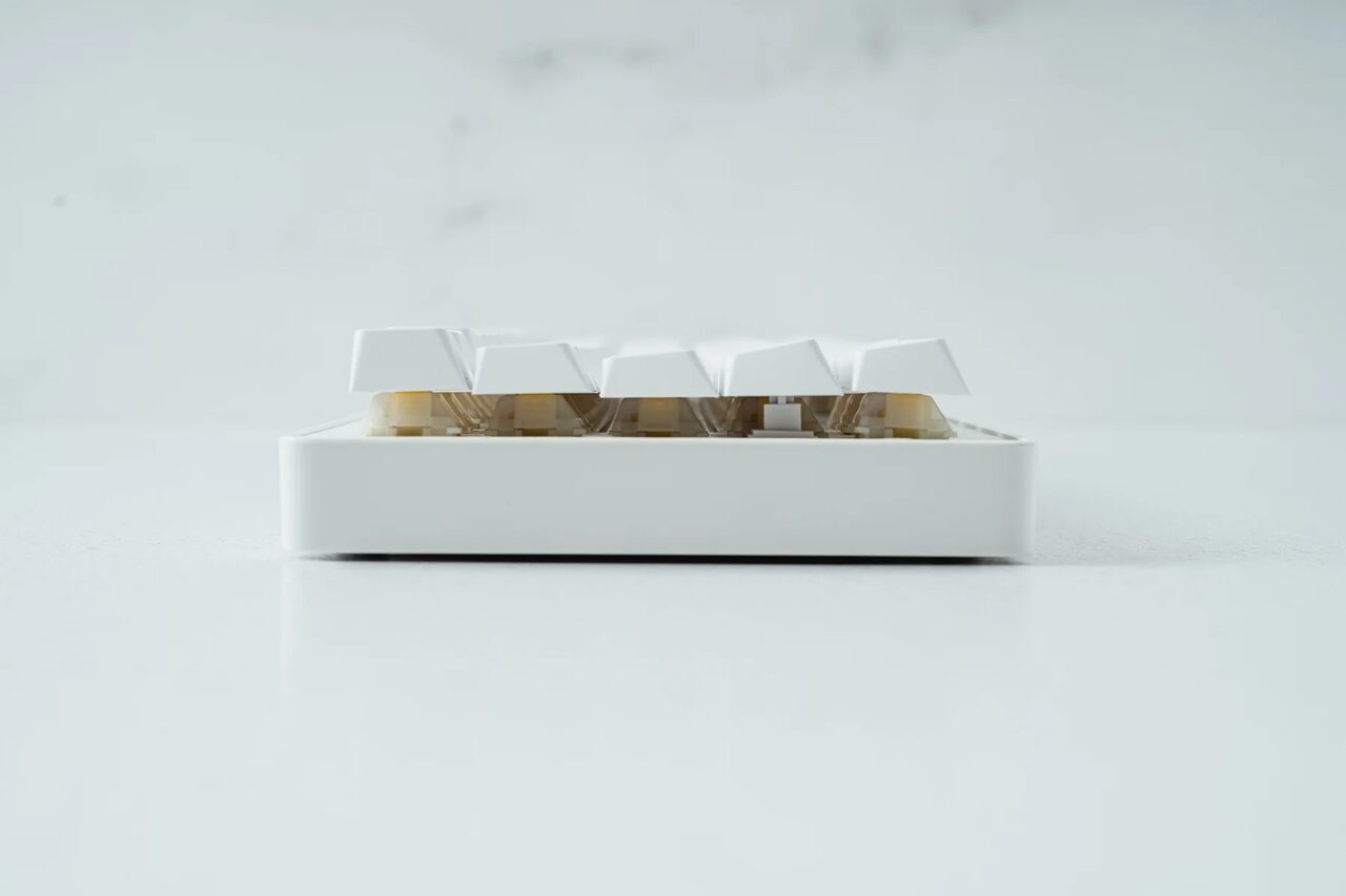
It was easy enough for me to convince him to try an heftier case and he took my word on it. They released the Eclipse High profile that is a chunk of 2400g aluminum that would obliterate your house flooring if you drop it!
They sent me a sample and I made a quick video review if you are interested.
The Good
Okay, let’s start from the good news.
Honestly it’s really gratifying to hold in your hands, it’s very “material” and solid and looks pretty darn good on your desktop.
The Eclipse features what they call “magnetic gasket”, it’s a bit of a gimmick honestly as all elements at the end rest on some piece of rubber. The rationale is that the plate levitates over same-pole magnets granting a very soft feedback. I would be curious to try to remove all the magnets and see how much of a different they actually make… But, hey, they are there and I’m not gonna complain.
Also the choice of switches tells us that they wanted the smoothest/quietest experience possible. It comes with linear Gateron Yellow switches but they are hotswap so at the end you can use whatever you want.
There are three versions of the Eclipse: the low profile plastic case, the low profile aluminum case and the high profile priced respectively $140, $225 and $315. Now if you ask me $140 for a high quality, bluetooth, backlit, fully customizable keyboard with PBT keycaps is a pretty darn good deal. Even if you forget the magnetic thing and the 100 layers of rubber and foam.
The aluminum variant is certainly more interesting but $225 starts to raise an eyebrow, it’s still good value but you really need to like the layout.
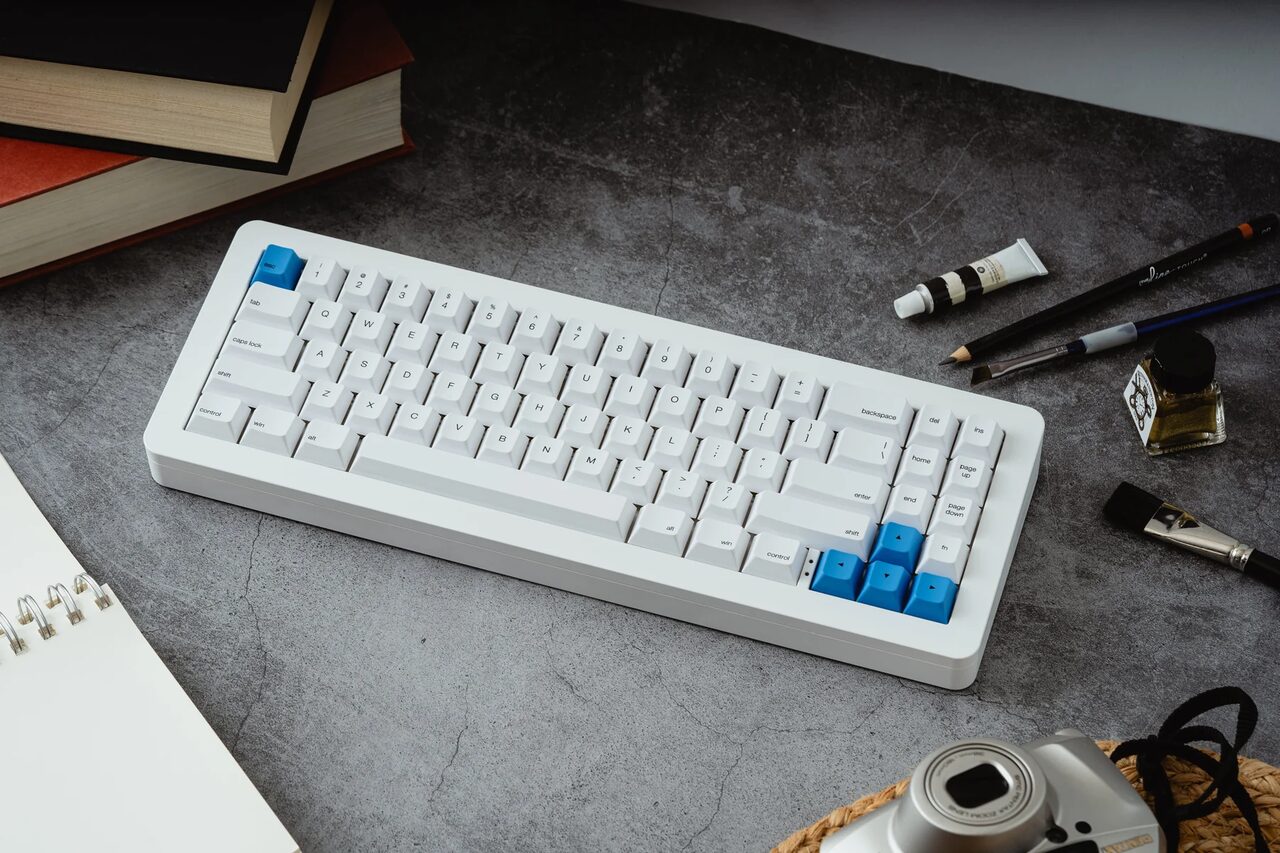
The high profile is on a different plane of existence. As I said it’s almost 2.5kg of aluminum and it looks really good. Typing on it is like caressing a soft velvet cloth and overall it just feels right. The $315 price tag though is a hard pill to swallow. It puts it head to head with “boutique” keyboards and only your wallet can tell you if it’s worth that much. From a technical/technological stand point I have no complains but still you really need to like it.
The Bad
It’s not all great of course.
The high profile version is REALLY high, probably too much and you need a wrist rest to use it for prolonged periods of time.
The overall sound (check the video for a typing demo) is very nice and silent but the spacebar in comparison is really noisy. It’s not a deal breaker but you can feel the difference and it breaks the magic. Fortunately it can be easily fixed with some foam inside the spacebar, I’ve suggested them to make it a default feature, hope they’ll listen.
The case is plated white (very resilient but not anodized) and I’m not a fan of the white-on-white combo (case+keycaps), but that’s just a personal thing I guess. The keys will weather and yellow differently to the case and over time you might see the difference.
A very small thing but the wireless switch on the back doesn’t align well with the high quality sturdiness of the whole keyboard. It’s flimsy, rattly and delicate.
One last suggestion to my good friends at Alpaca/Apos: put more effort in environmental-friendly packaging.
The Future
Now something I’m really excited about.
As mentioned already I’m collaborating with Alpaca/EclipseProject/Apos/Whatever and we are going to release some great stuff in the near future but they are all mid-long term projects.
To kick-start the collaboration we thought of an Eclipse Matt3o Edition. Can we elevate the design even further with just a few modifications?
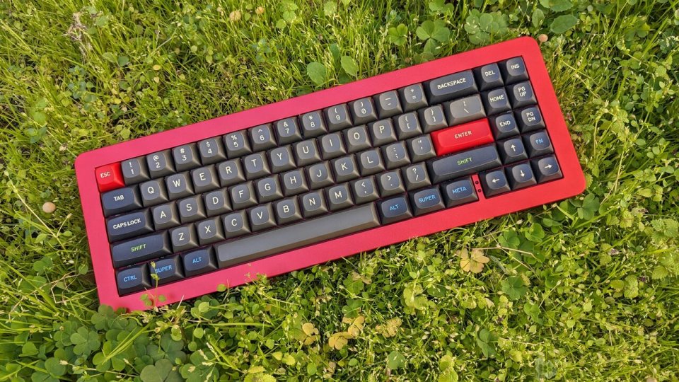
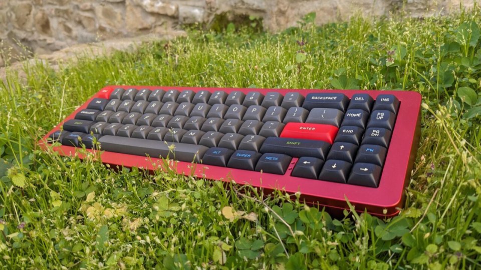
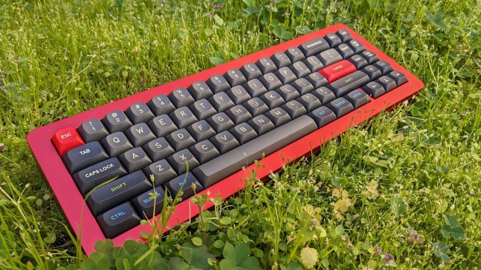
First of all… It must be anodized red. It’s so hard to take a good picture of the new case but it’s really amazing. If you look closely at the third picture above you’ll see that the color goes from purple to magenta to fire-red. This anodization spectacular.
Second: the keycaps must be MTNU and what better than Susu for this gorgeous red case?!
Lastly —I don’t have confirmation yet— but I’d like the spacebar to come with inside foam.
So as you see it’s not just “change the color and call it special edition” kind of deal. The modifications actually increase the quality of the product. I don’t have pricing or availability yet.. but soon™
Also soon more news on the other, more substantial, projects! Stay tuned!
Comments
Oh man, what I wouldn’t give for a True Fox layout instead! Was hoping that their PCB would support it. Alas…
Hoping for a MTNU Topre 100% keyboard. Can’t do without a number pad. I’d buy them for home and office.
I just received my Whitefox Eclipse from Aptos today (via Amazon), and I really wish I had a True Fox layout version. I am used to having the backspace key under the number row.
Additionally, I usually swap the Control and Caps Lock keys, but they didn’t provide a Control keycap in the size of the Caps Lock. It would be nice to have it included in the backup keycaps.
Everything else is perfect.
Agreed! My favorite thing about my OG white/Nite fox is the split backspace. MATT30 BRING IT BACK!!!
Sorry, comments are closed but you can still get in touch with the contact form.